

Chartreuse is the color precisely between green and yellow,
so it’s 50% green an 50% yellow. If that’s
hard for you to picture just think about mixing lemons and limes.
Personally, I feel that it’s a forgotten color. You could even say it’s a ‘unique’ color and
somewhat stringent. It’s bright and bold
but on the other hand it plays well with other colors. Mixed with pastels, jewel tones and dark
neutrals, chartreuse pops!
I find that a lot of gals including myself find it difficult
to wear bright yellow. Chartreuse is the
perfect shade to give you that lively look but slightly toned down.
Side Note: I’ve
brought chartreuse into the interior design of our home … stay tuned to see how
and where!
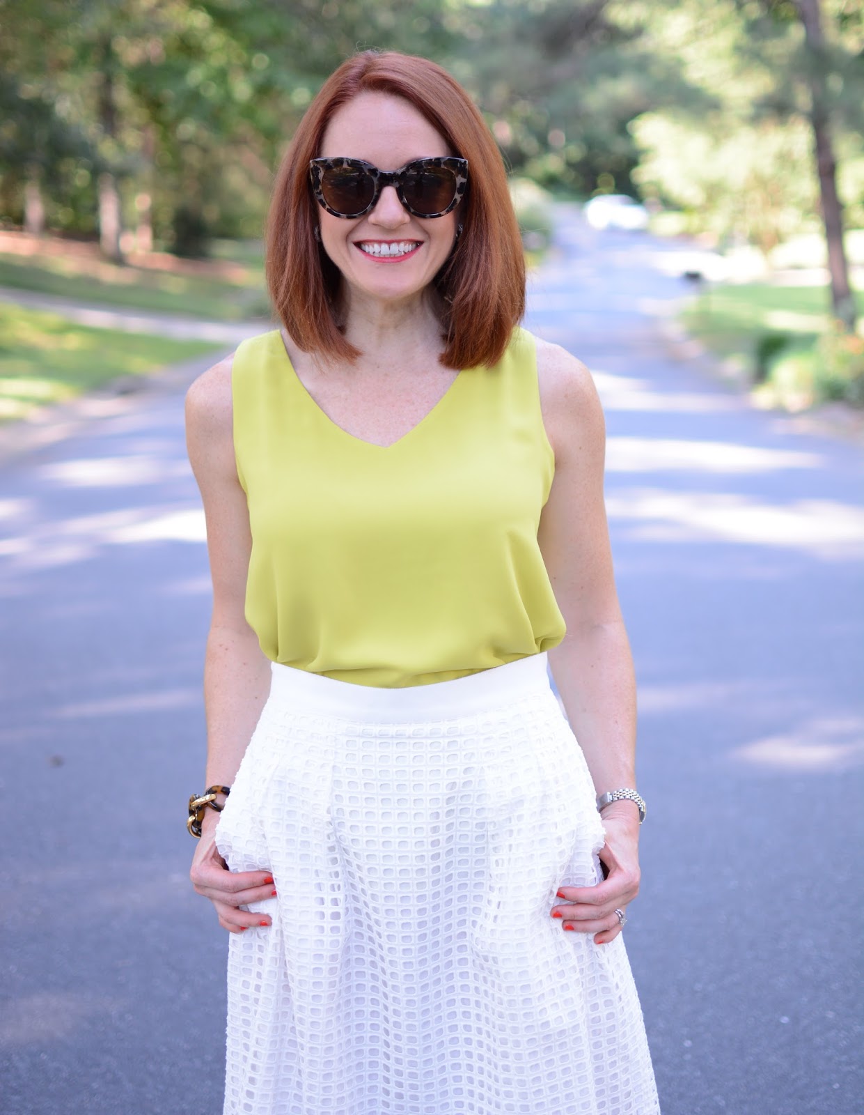
I went with a bright summer look and paired this chartreuse
blouse with a white eyelet skirt for pattern and texture, a soft pastel pink
bag for softness & added color and a dark tortoise bracelet for a pop of
contrast and shine. With all my outfits
I strive to incorporate the elements of color, texture, pattern and shine.


Dress Beautifully in Chartreuse
XOXO Sarah Louise
P.S. Pairing Options ...


No comments:
Post a Comment