You know what else is true ‘Home is where the heart is’ and there’s a lot of love in ours. Every Tuesday this month I’m sharing small updates we have made until we can call in the big guns for renovation. We love our home and intend for it to be our forever place. Ryan says we aren't moving again until the old folks home. We want to make a lot of changes so that it does in fact reflect who we are.
Here's the reality, renovations and design come at a cost. The appeal of our home was that it was a classic, extremely well built colonial that just needed love, and we wanted the opportunity to pick out all the design elements of our spaces. Outside of the master bedroom, bath and closet this house was all outdated. We've spent the past year and a half living here investing in structural and functional repairs as well as extensive landscaping. This is the not the fun part of home ownership. #adulting
We are so ready to work on our interior, the places people actually see rather than our crawl space.
Again, there's the cost element UGH!
Note: Prior to getting married Ryan & I agreed on our financial model of living on 1 income and only financing our home (as little as possible) and one vehicle at a time (and hopefully have some years with none).
Neither of us are DIY people, and honestly we both want classic and quality design that just can't be achieved outside of the experts. However, we have managed to add some pretty touches.
Since we are all at home, I find that this is a good time to share some of these updates!
Both of the homes we've owned had sunrooms (very popular in midcentury homes) and a huge selling point for us.
I love a space that has lots of windows to enjoy the view of the outdoors with the comforts of indoors.
I'll start with the room transformation that shines the brightest, our sunroom ...
White Washed Brick
I love that our late Scragley is in this picture
Our sunrooms were his favorite too
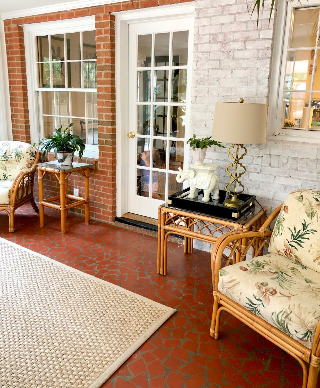
I love the exposed brick exterior wall but it's just so red (my LEAST liked color for home design).
I waited a year before doing something about it as I wanted to be confident before altering the brick as you can't undo it!
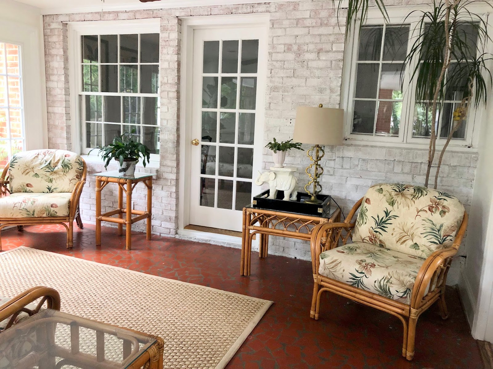
I decided on a white wash so that we didn't loose the look of the brick that using solid paint would do and I don't like smearing/distressed techniques as they feel messy to me.
I did what I was supposed to do and consulted Pinterest and Youtube before jumping in.
They lied on it's simplicity and ease.
It was a MESS!
I ended up diluting white paint we had left over from our powder room and found that trying to measure according to the tutorials I watched wasn't giving me the results I wanted so I just diluted to a consistency that gave me what I was looking for. The brick had variations of colors that I truly wanted to showcase. I wanted a cohesive thin white covering that let the underneath shine through.
Ta Da!
White washing the brick lightened the room dramatically! And I didn't loose the textured element of the brick wall.
The floor was covered in splatters and I was tired but all worth it.
Now I REALLY had to do something about the hideous floor!
Painting Concrete/Mosaic Floors
Our plan for this floor is to add new tile.
We want to make sure the tile we choose is cohesive with the overall design of our home so we are holding back with our selection. We also want to renovate multiple rooms at a time which is a cost savings but also takes more time.
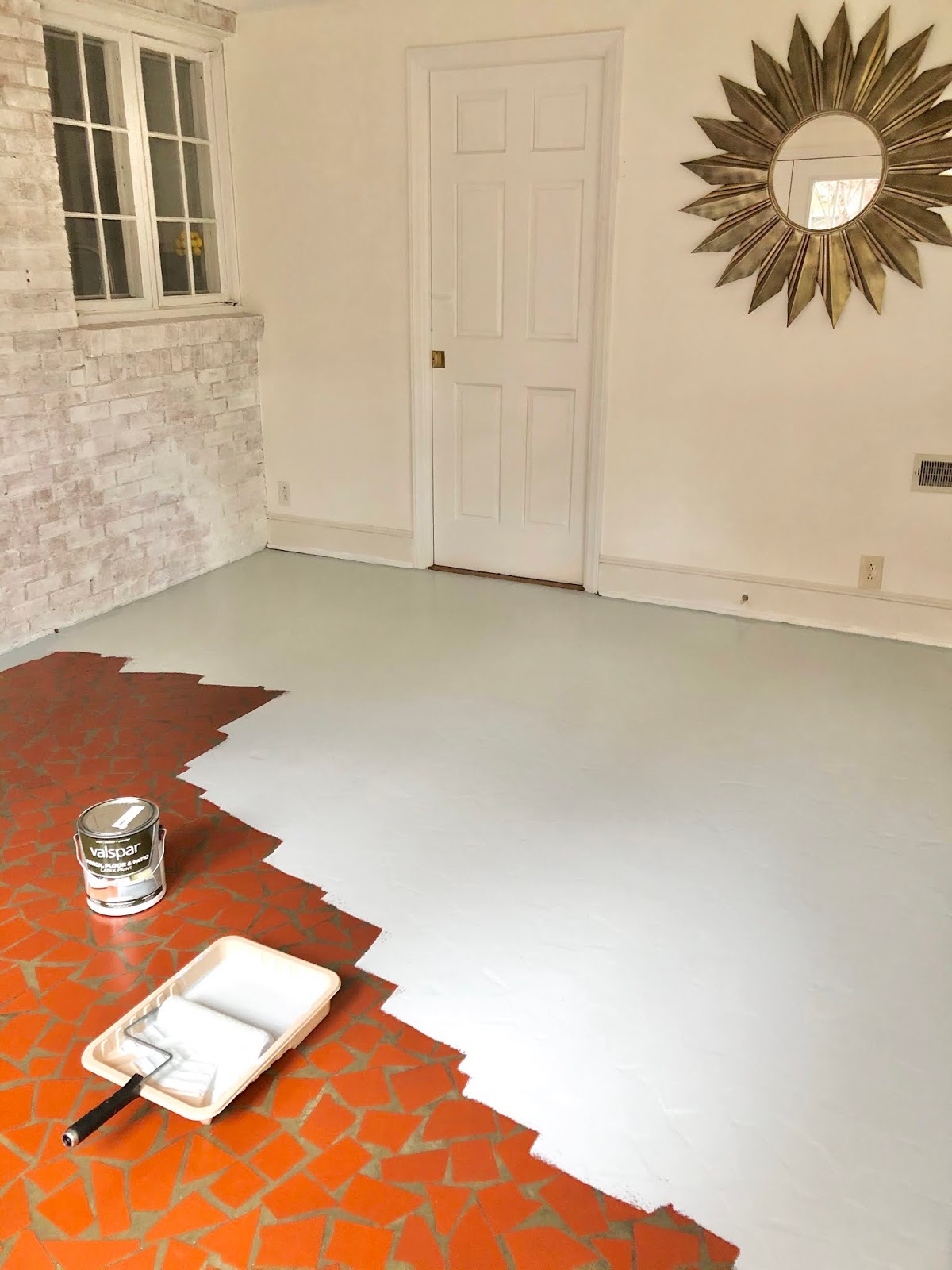
I just could NOT look at this horrendous floor (I couldn't hate it more) any longer so I made a run to the hardware store and slapped some paint on it one morning while Vivian was in school.
It was so easy! Thank goodness, after white washing the brick I was discouraged at every doing another project.
The only negatives are that high heels and other rough objects will scratch it off and it shows dirt terribly. It's doesn't help that it's a solid color and our highest traffic area from the outside.
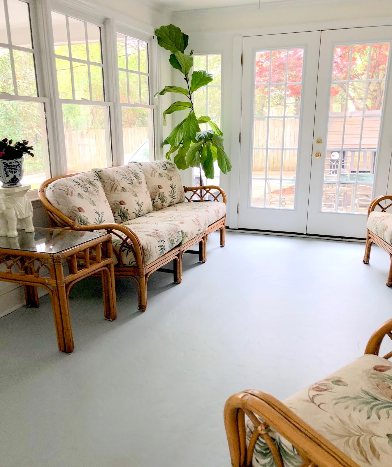
And just when I thought the white wash brightened the room, the floor paint took it to a whole new level!!!
I can't decide if I prefer the rug or no rug
I am beyond please with the look.
However, tile will be a much better solution long term and now I have an idea of where I want to go with color and pattern.
We removed the door from this room leading into our home and I rearrange the furniture and decor all the time
We plan on adding a new fan and reupholstering the cushions in a fun pattern! Similar to this citrus design.
Just as we as humans are works in progress, so are our homes. There's no such thing as perfect but any space with us in it is perfect for me!
White Wash Color - Benjamin Moore Chantilly Lace | Floor Paint - Color Slate Stone
Dress Your Rooms Beautifully with Bright Paint
And don't forget plants!
XOXO Sarah-Louise


No comments:
Post a Comment